Fonts and typography
Consistent use of typography reinforces Hennepin County's brand identity. Our corporate typeface, Myriad Pro, helps to convey a warm and friendly interaction. Myriad Pro is easy to read and is a humanistic sans-serif typeface. It conveys warmth, is simple, and is straightforward. It aligns with our communication values of being clear, direct, and accessible.
Using consistent typography and logical hierarchy makes content clear and scannable. Our text sizes, styles, and layouts balance content and UI (user interface). They also foster familiarity.
For more information on writing content for websites, visit Writing for accessibility.
Type scale
As a general guide, headlines should be twice as large as subheads, which should be twice as large as body copy.
Follow the heading sizes and styling to ensure accessibility and maintain brand consistency. Headings are hierarchical, with <H1> representing the main idea of the page.
Headings from <H2> to <H6> help provide more organization and subsections to the content.
Myriad Pro headings
Heading 1 - 4
Segoe UI headings
Heading 1 - 4
H1 42px
Heading - Desktop
H1 34px
Heading - Mobile / Tablet
H2 28px
Heading - Desktop / Mobile / Tablet
H3 17px
Heading - Desktop / Mobile / Tablet
H4 16px
Heading - Desktop / Mobile / Tablet
Body copy
Using font sizes 16px and 18px are both acceptable for text readability. The choice between the two depends on the density of content. For pages with lots of text, use the larger font size of 18px. This enhances readability and makes the content more legible for the reader.
Myriad Pro body copy
Segoe UI body copy
Line spacing
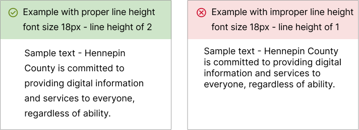
Body copy should be 16px - 18px with a line height of at least 1.5 to 2. This makes it easier for users to read, especially those with disabilities.

Readability guidance
Visit Readability for accessibility.
Responsive design for typography
For styling typography for responsive web design, use relative units like em and rem. Avoid using absolute measurements like pixels. Pixels are unscalable measurements based on the display's resolution. Em and rem are both scalable units of font size, relative to pixel size.
Changing pixels to flexible units allows text to automatically adjust for different devices. This scalability also lets users control font sizes on their personal devices. It allows for more accessible and enjoyable reading experiences for everyone.
To learn more about responsive typography and line spacing, visit WCAG specifying line spacing in CSS.
Heading levels
Headings organize the content on a page. They help users scan and navigate a page. Headings give users an idea of what content will follow. Heading levels outline the hierarchy of the content. Page titles are set at <H1>. Headings after the page title begin with <H2> and can range to <H6>.
Headings are important for sighted users and users with visual impairment. Appropriate use of heading tags helps assistive technologies provide in-page navigation.
Each page should only have one <H1>. Don't skip heading levels. Follow the nested sequential order for heading levels. For example, don't skip from an <H2> to an <H4>. Sequential order lets users understand the relationship among sections of the page. If heading levels are out of order, it could confuse users.
Link styling
Link styles let people understand the state of the links they interact with. This helps links be clearer and more useful.
To style links:
- Use CSS to differentiate the states of a link. This includes visited and unvisited links, and the hover, focus, and active states.
- Only style text to look like a link if it functions like a link.
- When possible, set external links to open in a new tab.

For how to write links, visit Link standards.
For writing accessible links, visit Writing for accessibility.
For styling links, visit Colors.


