Writing for accessibility
This page has basic accessibility guidelines for writing digital text. For full writing guidance, visit the writing guide.Abbreviations
Don't use abbreviations unless the abbreviation is more common than the spelled-out version, like FBI.Alt text
Alt text is short for alternative text. Alt text is a text description of visual content like photos, graphs, icons, and charts. It lets people who use screen readers perceive and understand visual content.
Writing alt text
The county requires alt text for informational images.
When writing alt text:
- Describe the meaning of the image, not its visual attributes.
- Write a short phrase. Leave off the words a, an, and the.
- Leave off the words image and icon from the alt text.
Image example

Alt text: Staff member at a service desk showing someone how to fill out a form
Chart example
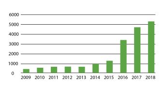
Write alt text and an extended description that conveys the full content of the chart.

Alt text: Graph showing number of tons of organics recycling 2009-2018
Extended description (place on the page near the image): Graph showing number of tons of organics recycling rose from just under 1,000 tons in 2009 to almost 6,000 tons in 2018
Map example

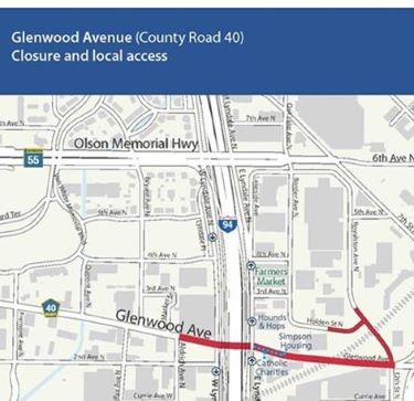
Write alt text and an extended description that conveys the full content of the map.
Alt text: Map of Glenwood Avenue closure that includes select access points to the street
Extended description (place on the page near the map): Map of Glenwood Avenue closure, showing access points into Glenwood Avenue. The closure runs from Aldrich Avenue North to 12th Street North. It includes parts of Holden Street North and Royalston Avenue. Access Simpson Housing and Catholic Charities at Glenwood Avenue and East Lyndale Avenue North.
Icon example
![]()
Green checkmark: First step is completed
Blank circle: Second step is not completed
Only write alt text for icons that serve a function. Decorative icons don't need alt text.
Decorative images
Decorative images don't need alt text. A decorative image adds visual interest but no useful information. If a user can understand the content without the image, it's decorative.
Context will also affect your decision about whether your image is decorative or informational.
For example: You use the below image of colored purses on a page related to street vendors. The content doesn't mention selling purses. Removing the image doesn't change the meaning of the content. So you can treat this image as decorative and not give it alt text.

Consistent identification
Use the same labels, names, and alt text for content that has the same function within a page or site.
Examples:
- Using the word Next for all buttons that advance a screen
- Using the link label Home for any link that returns the user to the homepage
Describing complex words
If you must use a complex word, consider defining or explaining it. How you do this will depend on your users’ needs.
For example:
- In a full definition: As part of a criminal case, the judge may order restitution. Restitution is payment to a crime victim for losses they suffered because of the crime. The person who committed the crime makes the payment.
- In a short definition: As part of a criminal case, the judge may order restitution (payment to a crime victim).
Images of text
Avoid using images of text unless it's essential to the image (for example, the logo with the word "Hennepin"). Any image of text must have alt text that includes the words from the image.
Link labels
Link labels are the text of a link. The label tells users where the link will take them such as a webpage or document. Users with screen readers will sometimes navigate a page from link to link. This makes meaningful link labels especially important.
Don’t use link labels that only say:
- Read more
- Learn more
- Click here
Make link labels specific and meaningful, for example:
- How to qualify for the homestead program
- Absentee voting process
- Apply for a library card
Be mindful of using language such as see (the page), look at (the information), or view (the content). These words assume users’ ability. Instead use inclusive language, such as visit, review, or access.
PDFs, Word documents, and other downloadable files
Downloadable files are for content that someone needs to print. Since most people don't print the content, make sure files are useful as online material.
Downloadable files should meet accessibility requirements.
They should:
- Have a clear title
- Put headings in sequential order
- Put key content in body text, not graphics
- Use tables for complex data, not layout
- Follow county writing standards
Avoid using Microsoft Excel and Microsoft PowerPoint files unless you convert them to PDF. Also follow accessibility standards for the PDFs.
Microsoft Word and Adobe Acrobat have accessibility checkers.
For help making documents accessible:
Reading level
Aim for a reading level of grade 6 to 8. Never use reading level alone to measure readability. Instead, use it as a tool to support careful review by humans. You can measure reading level with tools such as the one in Word.Sensory characteristics
Write instructions so someone can understand them without having to rely only on visual cues, like color, shape, or location.
For example:
No: Submit your form using the blue button at the bottom of the screen
Yes: Submit your form using the blue button labeled ‘Submit application’ at the end of the form
Summarizing complex content
If you must provide content in a complex way, you can create a summary. A summary gives key information without requiring that someone read all the detail. A summary could include key details or themes.For example:
(Report summary) Since 1990, homelessness in Lincoln County has become more widespread and chronic. This is especially true for families. The county has increased funding for housing programs by 33% and staff by 15 people. Staff provide services in housing, employment, and mental health.
(Full report) Visit the Lincoln County 30-year report on homelessness (PDF).
Tab titles
The tab title is text that appears in the browser tab. Screen readers announce tab titles when a user opens a new browser tab. Users with visual impairment then know which site or page they have open.
How to write tab titles:
- Use the H1 page title and website name.
- Separate them with the pipe character.
Examples of tab titles:
- Eye care | NorthPoint
- Home | Hennepin County Design System
- Property tax assessment | Hennepin County
Transcripts and closed captions
A transcript is a written record of the speech and sound within a video or audio file. Closed captioning is a display of real-time text of all audio within a video.
Auto-generated closed captions often have mistakes that mispresent the content. Platforms like YouTube and Vimeo have auto-generated closed captions. Correct any mistakes in those closed captions. Follow the platform's instructions for correcting closed captions.
Inaccurate closed captions may create legal risk for the county. They may fail to adhere to federal accessibility law.
Required text versions of video and audio:
- Prerecorded video without sound must have an audio description or text transcript available.
- Prerecorded video with sound must include synchronized captions. It must also include an audio description or a text transcript.
- Prerecorded audio only must have a text transcript available.