Tables
Under review
We are in the process of reviewing this component, content, or guidance to make improvements
Effective tables help people compare items. Use them with caution because they have accessibility issues.
Types of tables
Responsive tables adjust their layouts based on device, screen size, and browser.
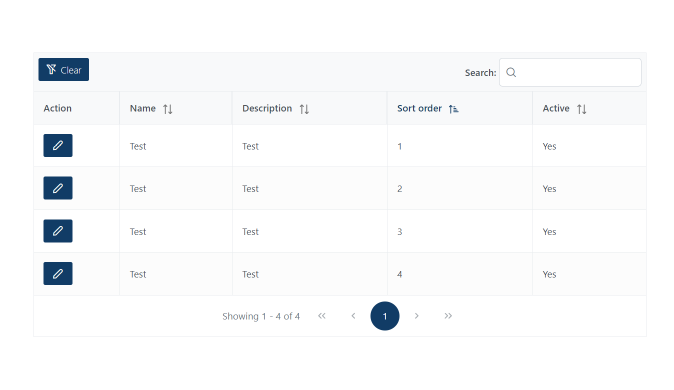
Sortable tables let users filter the rows based on their preference.
When to use
- Use tables to display tabular data, like lists of users or financial records.
- Use tables for showing large datasets.
- Use tables to let users compare data in different rows and columns.
When not to use
- Don’t use a table if you can display the content as a list with headings.
Code tabular information in a logical way. This lets screen readers convey the relationships among the columns and rows.
Considerations for developing tables
Use of caption
A caption functions like a heading for a table. It helps users with screen readers to find a table and understand what it's about and decide if they want to read it.
Use of th
Designate table headers with th. It is also a good idea to make the scope explicit by adding a scope of one of the following: col, row, colgroup, or rowgroup.
Layout
Never use tables to lay out webpages. But if you can't edit the HTML, you must use role="presentation" to identify its purpose.
Sorted tables
Sorted tables should use buttons in the column headers. This allows :focus and native keyboard controls to activate the sorting functionality. Use an aria-live region to alert screen readers when they've sorted a table and how the sorted data displays.
Presentation role
Specify presentation as the role if you must use a table for layout.
Accessibility standards
Follow accessibility standards. For example, tables must have column or row headers. Get help making a table accessible.
Table strips
When possible, use a table strips, sometime called zebra-striped table style. This stripe effect alternates slight variations in row background color. This helps tables appear organized and helps guide a user's eyes across wide tables with a lot of data.
Table borders
Table borders is also an acceptable approach to help guide a user's eyes across tables with a lot of data. This is especially true when using colspan.
Responsive design
- Make tables responsive to smaller screens by using media queries.
- For wide content, use the
overflow-x: autoproperty to a table's parent element. - For tall content, use the
overflow-y: autoproperty. - The choice between properties may also depend on your responsive design strategy.
- For smaller screens, choose the most useful type of scrolling based on the content and design.