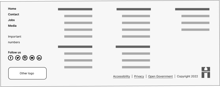
Footers
Footers across the bottom of every page tells users when they’ve reached the end of a page. Footers improve the usability of a website. They display useful, expected navigation elements and information. Footer content is easy to access and available to users on every page of the site.
Footers must display their content in a consistent way across all pages. The content of the footer will depend on the purpose of the site or application. Choose the right footer type to meet the user’s needs and site’s goals. The most common types are basic footer or utility footer.

All footer elements should use HTML5 and ARIA role landmarks with focus indicators. Assistive technology can then help users understand site structure and navigate pages.
Footer links
You can add many features in footers. But only choose those that add value to the user. For example, too many links will make it hard for the user to find what they need. Avoid replicating the full site map or menu. Be cautious not to use the footer as a catch-all for hard-to-place content.
Common links to place within footers:
- Phone number
- Email address
- Physical address
- Accessibility and privacy policy
- Copyright information
Common navigation features and links in a utility footer:
- Doormat navigation: a replica of the global and main navigation
- Secondary task links: contact, jobs, media information, phone numbers, and addresses
- Outreach and engagement: social media links and email sign up
Basic footers
Basic footers work well on smaller sites, like microsites.
All footers must display at least 3 items:
- The Hennepin County H logo in the lower right corner
- Links to the county’s accessibility, privacy policy, and open government policy
- Copyright information

Basic footers may also contain contact information, social media, or email newsletter sign-up content. This will depend on the needs of the site.

Mobile footers
Optimizing the user experience for small screens:
- Mobile users need to focus on the most relevant links or actions. That's because they have less screen space than on desktop. The reduced utility footer can help users focus on relevant links and actions.
- Touch screens are the primary input method for mobile devices. Tapping on small links can be challenging. Use a design that's easy for people to use with their fingers.
Utility footers for mobile:
- Choose the most important links and elements for the footer. Users can then access critical functions or information.
- You don’t need to display all utility footer links in mobile.
- It’s important to balance providing key information and maintaining usability.

Utility footers
Utility footers have navigational links to help users navigate complex sites.
A utility footer helps users take navigation shortcuts. For example, a utility footer could include a newsletter sign-up. It could also include links to a contact page. A utility footer can improve the experience for users who rely on it for navigation.
