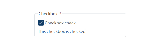
Checkbox
Checkboxes let users choose one or more options from a list. They also let users uncheck an option to change their mind. All checkbox options are visible which makes it easy for users to change their selection. This makes checkboxes understandable and user friendly.
When to use
- Use a single checkbox as a toggle to select or unselect a not-required option. For example, use a single checkbox to ask a user if they’d like to sign up for a newsletter.
- Use multiple-answer checkbox to let a user choose any number of options.
When not to use
Avoid a checkbox when a user is required to answer a question. You can use a single radio input with yes and no options to ask a user to agree to the terms of a service agreement. For information about restricting users to only one answer, visit the Radio button component.
Group the checkboxes within a <fieldset> with a descriptive <legend>. This helps a user understand the context of the group. For example, What type of residence do you live in?
If asking one question per page, use the appropriate heading level for the <legend> content. Don’t use a heading level if asking more than one question per page.
Match each <input> element’s id attribute to its <label> element’s for attribute.
Use conditionally revealed questions with caution:
- They can create issues for users on screen readers. The user doesn’t always know if a conditionally revealed question is hidden or shown.
- When using a conditionally revealed question, make the follow-up question simple. Users on assistive devices are less likely to miss simple questions. You can use a simple follow-up question, like How would you like us to contact you, with choices such as Email, Phone, or Mail.
- Avoid complicated questions.
- Make clear users can select more than one option. Add a hint, such as Select all that apply.
- Make the checkbox and its label selectable.
- Put checkboxes in alphabetical order, or from most-to-least common option.
- Begin the first word of each checkbox option with a capital letter.
- Create descriptive and short labels for each checkbox.